
AI Agent Icons: A Visual Guide to Recognizing Modern AI Assistants

Picture a marketer opening a dashboard with twelve AI agents arranged down the sidebar. Each tile shows a slightly different shade of robot head. They need the one that drafts blog posts. They hover. They guess. They misclick. Thirty seconds gone. Multiply that by every team member, every day, every week, and you're staring at a real productivity tax disguised as a design choice. An ai agent icon is supposed to prevent that tax — but most platforms treat it as decoration, and the cost compounds quickly.
This guide unpacks how to design, decode, and deploy AI agent icons that signal function before a tooltip ever loads. You'll get the four dominant visual languages, a five-step decoder, six scaling principles, real production specs, a working six-agent case study, the most common mistakes, and a three-phase build checklist.
Table of Contents
- Why AI Agent Icons Are a Functional Contract, Not Decoration
- The Four Visual Languages of AI Agent Icons (And When Each Wins)
- A Five-Step Framework to Decode Any AI Agent Icon
- Six Design Principles for an AI Agent Icon System That Scales
- Production Specs — Sizes, Formats, and Timelines That Actually Ship
- VibeCody's Six-Agent Icon System — A Working Case Study
- Five Common Mistakes That Break AI Agent Icon Systems
- Your AI Agent Icon Build Checklist — From Brief to Deployment
Why AI Agent Icons Are a Functional Contract, Not Decoration
An ai agent icon is the user's first cognitive handshake with what the agent does. It has to signal the category of work the agent performs before any text label loads, any tooltip surfaces, or any onboarding tour explains the roster. When that handshake fails, every downstream interaction inherits the confusion — and the failure mode is almost invisible because nobody files a bug report for "I hesitated for two seconds."
Jakob Nielsen and the team at Nielsen Norman Group have argued for years that icons are rarely self-explanatory, that unlabeled icons cause frequent misinterpretation, and that for any function used infrequently — exactly the pattern of an agent roster where you might call the Lead Hunter twice a month — icons must pair with labels to function reliably. The icon doesn't replace the label. It accelerates the label. If the icon-to-meaning mapping is fuzzy, the user falls back to reading every label every time, and you've built a menu, not a dashboard.
Susan Weinschenk's work in 100 Things Every Designer Needs to Know About People reinforces the same point from the cognitive side: visuals are processed extraordinarily fast, but only aid task performance when the symbol-to-meaning mapping is obvious. Otherwise the visual system hands the job back to the language system, and you've added a step instead of removing one. This is the entire reason agent icons matter — they either compress recognition or they tax it.
Microsoft's AI Agentic Design Principles push the same principle into the agent context specifically, calling for consistent, familiar icons — a microphone for voice, a paperclip for file upload — to reduce cognitive load across multi-modal agent interfaces. The principle is boring on purpose. Familiar primitives work because users have already paid the learning cost.
An AI agent icon isn't decoration. It's a contract — telling the user what the agent specializes in before they ever click.
Salesforce's design team ran into the same gravity from a different angle. They capped agent names at 10 characters ("Name + Agent") after finding that long or vague names broke layouts and confused users in lists and dropdowns. That's the icon-name pair operating as a single identifier: if the name fails, the icon has to carry more weight; if the icon fails, the name has to carry more weight. When both fail, the agent might as well not exist. This is also why pattern recognition across complex agent workflows depends so heavily on visual scaffolding — the icon system is the substrate on which users build mental models of the platform.
In a multi-agent platform, this pressure multiplies. A roster of six specialists — Blog Writer, Web Scraper, Lead Hunter, Report Builder, Content Repurposer, Support Drafter — has to feel like six distinct tools, not six skins on the same chatbot. A generic robot head repeated six times in different colors isn't a system. It's a confusion engine wearing a paint job. The rest of this guide breaks down what works instead: the visual languages teams actually deploy, how to read any icon for its functional intent, six principles for systems that scale past your first roster, real production specs, a working case study, the mistakes that quietly break everything, and a checklist you can hand to a designer tomorrow.
The Four Visual Languages of AI Agent Icons (And When Each Wins)
Most agent icons fall into one of four visual languages. Each carries a different implicit promise about what the agent does, and mixing them inside one roster is the fastest way to break scanability.
| Visual Language | Typical Symbol | Best Use Case | Documented Risk |
|---|---|---|---|
| Robot / Humanoid | Mechanical head, circuit face | General conversational agents | Generic robot heads clash with brand identity |
| Tool-Specific Hybrid | Pen, magnifying glass, crosshair | Task-specific agents in a roster | Custom design per agent; harder past ~15 agents |
| Abstract Neural / Geometric | Nodes, hexagons, motion arcs | Platform-level or meta agents | Sci-fi clichés undermine conceptual clarity |
| Chat / Conversation Bubble | Speech bubble with bot or sparkle | Reactive support assistants | Signals reactive help, not proactive execution |

Remote Lama recommends literal, tool-based icons for task-specific agents and abstract geometric symbols for platform-level or general-purpose agents. Their reasoning is empirical: literal icons perform better at small sizes (16px–24px) and for single-purpose work, because the symbol carries semantic weight even when scaled into a sidebar. Meanwhile, NetworkStrategics' 2026 best-practices guide warns that over-generic robot heads — the default fallback for teams without a system — frequently clash with established brand identities and signal "we picked this from a stock pack."
The choice isn't aesthetic; it's contractual. A robot head says I'm a generalist assistant. A pen says I write. A crosshair says I target. A speech bubble says I respond when spoken to. Mixing those languages inside one roster forces users to context-switch between visual grammars on every glance. Tool-specific hybrids tend to win for multi-agent platforms with functionally distinct specialists, because each icon can carry its own functional promise without leaning on color or label to disambiguate.
A Five-Step Framework to Decode Any AI Agent Icon
Before you design an icon, learn to read one. Here's the five-step decoder.
- Find the embedded tool. Does the icon contain a recognizable object — pen, magnifying glass, chart, wrench, crosshair? That object is the agent's primary function. Remote Lama's framework names this the "domain metaphor" and treats it as the single most important signal an icon carries. If you can't name the tool inside three seconds, the icon is already failing.
- Read the color family. Warm tones (orange, red) typically signal creation, writing, or high-intent action. Cool tones (blue, cyan, teal) signal analysis, research, or transformation. Purple often signals synthesis or multi-tool work. Color alone never carries function — but it groups agents into scannable categories the eye can sort before the brain reads.
- Look for motion cues. Remote Lama distinguishes static utility icons from agent icons by the presence of directional arrows, cycles, or flows. These cues tell users this thing acts for me, not just this is a tool. A pen alone is a utility. A pen with a motion arc behind it is an agent. The arc is doing real semantic work.
- Judge visual complexity at icon size. Simple, bold icons map to single-purpose agents. Layered or composite icons map to multi-task agents. Microsoft's agent UX guidance favors familiar primitives over flashy detail because a 24px icon with seven elements becomes a blur. If the icon has more than three distinct visual elements, ask what each one contributes.
- Identify the framing metaphor. Is the agent presented as a person (humanoid), a tool (object-focused), or a system (abstract/technical)? This frames whether the user feels they're commanding an assistant, invoking a function, or triggering a process. Each shapes expectations about latency, autonomy, and output format — even before the agent runs.
Run this five-step decoder against your current agent roster. If you can't complete all five steps for any icon, that icon is failing its job.
Six Design Principles for an AI Agent Icon System That Scales
These six principles separate icon systems that hold up across 50 agents from those that fall apart at 6.
- Consistency Beats Novelty. Every icon in your roster should share a visual family — identical line weight, proportion, corner radii, padding rules. Salesforce explicitly phased out legacy icons and standardized agent avatars to make experiences recognizable across products. Mixing a detailed 3D robot with a flat geometric node creates cognitive noise that no amount of color-coding can rescue. Pick one dialect. Write it down. Enforce it.
- Function First, Aesthetics Second. The icon must communicate the agent's role before it communicates "this looks modern." If it's beautiful but no one knows what the agent does, it failed. Nielsen Norman Group's research is unambiguous on this point: recognizable, concrete metaphors outperform abstract symbols when fast recognition matters, and agent rosters are exactly that context.
- Design for 16px First, Not 512px. Remote Lama recommends designing simultaneously at 512px, 64px, and 16px — and at 16px the icon should collapse to 1–2 recognizable shapes, not a naively downscaled version of the master. Detail evaporates at small sizes. If your icon falls apart in a notification tray or mobile toolbar, it's a liability dressed as an asset.
- Assign Color by Function Category, Not Per Agent. Group agents into 3–5 functional categories (content creation, research/data, automation, communication) and give each category one color family. This creates instant scanability across a large roster. Limiting your palette to 4–5 colors max prevents the visual chaos of "every agent gets its own color, and now nothing groups."
- Combine Domain Metaphor With Motion Cue. Remote Lama's signature framework pairs a core domain metaphor (document, chart, magnifying glass) with subtle motion cues (arcs, nodes, pulses, arrows) that imply the agent acts on the user's behalf. This pairing is what visually separates an agent from a static menu item — and it's the single design move most teams skip. It also keeps icons tool-centric rather than model-centric, which matters because users rarely care which model powers an agent; they care what the agent does.
- Avoid the Overused Tropes. The lone robot head. The brain with circuits. The generic chat bubble. These have become UI wallpaper — NetworkStrategics flags them as part of the drift away from overly stylized and skeuomorphic agent icons that 2026 best practices reject. Opt for tool-specific symbolism that telegraphs function. If your icon could appear in any AI product without modification, it's not your icon.
Design your icons for 16 pixels first. If they hold up there, they hold up everywhere.
Production Specs — Sizes, Formats, and Timelines That Actually Ship
Concrete production benchmarks matter because "design a few icons" is the kind of project that quietly consumes a quarter when nobody scoped it properly.
End-to-end AI agent icon system design commonly spans 4–8 weeks from defining agent roles through deployment, according to Remote Lama's consulting practice. The realistic breakdown looks roughly like this: about one week on strategy and role definition (which agents exist, what they do, how they group), one to two weeks on concept sketches and metaphor exploration, two to three weeks on multi-size design and refinement, and one to two weeks on production exports and documentation. Teams that try to compress this to ten days almost always end up redesigning within the year because the strategy work got skipped.
The keyline sizes Remote Lama prescribes are 512px, 64px, and 16px, designed in parallel rather than sequentially. Each size gets its own optical treatment — strokes thicken at 16px, decorative elements drop, corner radii adjust to maintain visual consistency under aggressive simplification. The 16px target is the hardest constraint in the entire system: at that size the icon must compress to 1–2 high-contrast shapes, period. Anything more becomes a smudge.
The full size range an icon must survive runs from 16px favicons up to 1024×1024 app-store assets — a 64× scale range. A single master file scaled down loses clarity at the smallest end; a single master scaled up reveals construction flaws at the largest end. Producing optical variants per size tier is the professional standard, not a luxury.
| Asset Type | Format | Use Case |
|---|---|---|
| Master source | SVG + 1024×1024 PNG | App store, scaling source |
| Standard web | PNG at 1×/2×/3× | Web app, retina displays |
| Browser tab | ICO | Favicons across browsers |
| Performance web | WebP | Optimized web delivery |
| Native app | Platform-specific PNG sets | iOS, Android, web apps |

Taskade's AI Icon Design Agent gives a useful preview of what mature icon workflows lock down before any pixels are pushed: icon shape concepts, platform-specific size grids, padding rules, stroke weights, corner radii, color usage rules, shadow treatment, and scalability guidance. This documentation-first approach is what prevents ad-hoc inconsistency — the kind that creeps in when a new designer joins six months later and reinvents the line weight because nobody wrote down the original spec.
Most teams underestimate the production tail. Designing six icons is the visible work. Producing 30+ asset variants per icon (six agents × five formats = 30 files minimum, often 60+ when you count density variants and dark-mode versions) is the work that actually ships. Budget for it explicitly or watch your launch slip.
VibeCody's Six-Agent Icon System — A Working Case Study
Most icon design guidance lives in the abstract. This section walks through a six-agent system in production and unpacks the choice behind each icon.
| Agent | Function | Symbol | Color Family | Design Logic |
|---|---|---|---|---|
| Blog Writer | Long-form content | Pen / quill | Warm orange | Pen = writing; warm = creative output |
| Web Scraper | Structured extraction | Magnifier + arrows | Cool blue | Search + motion cue = agent, not finder |
| Lead Hunter | Prospect targeting | Crosshair / target | Warm red | Precision intent, not generic search |
| Report Builder | Data synthesis | Chart over document | Cool purple | Compound symbol: creation + analysis |
| Content Repurposer | Format transformation | Circular arrows | Cool teal | Circular motion = transformation |
| Support Drafter | Response composition | Chat bubble + pen | Neutral gray-blue | Conversation + composition, not reply |
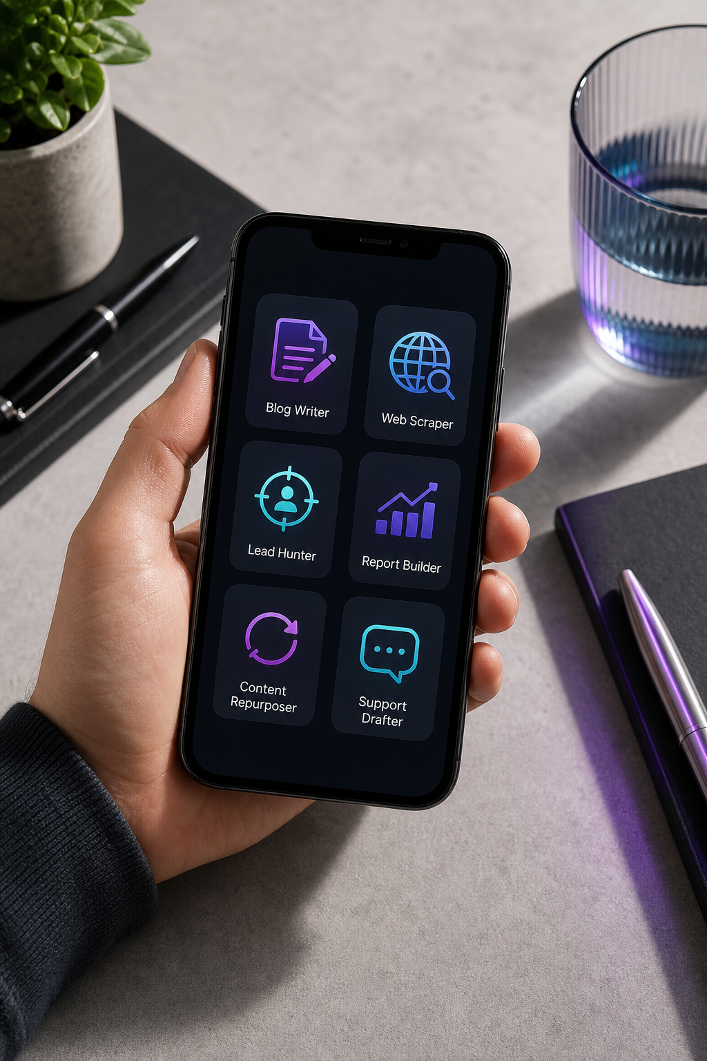
Every icon in the system is a compound symbol rather than a generic robot. The Blog Writer doesn't have a humanoid face; it carries a tool. This teaches users — within seconds of seeing the dashboard — that they're looking at specialized execution engines, not a single rebadged chatbot wearing six costumes. The Lead Hunter's crosshair is doing especially deliberate work: a magnifying glass would imply general searching, which is the Web Scraper's job. The crosshair signals precision targeting and intent, which is what prospect identification actually is.
The color logic stays tight: four color families across six agents. Warm orange and red carry creation and high-intent action. Cool blue, teal, and purple carry analysis and transformation. Neutral gray-blue carries communication. This stays inside the 4–5 color limit that prevents palette chaos, and each functional category gets a scannable family rather than a one-off color.
What's not in the system is as important as what is. No brain-with-circuits motifs. No lightning bolts. No nebulous "AI" symbolism. The icons are tool-centric, not AI-centric. The user doesn't need to know which underlying model powers the scraper; they need to know that the scraper scrapes. This mirrors Microsoft's principle of using familiar primitives rather than foregrounding AI-ness — and it pairs naturally with the platform's delivery model, which pushes finished output directly into GitHub, GitLab, or Bitbucket repositories so the agent looks like a teammate, not a chatbot interrupting your workflow.
The motion-cue choice is the other deliberate move. The Web Scraper's extraction arrows and the Content Repurposer's circular arrows are the agency signals Remote Lama prescribes — they're what visually separates an agent (acts on your behalf) from a static utility (sits and waits for a click). The scale test is the final filter: every icon in this system holds at 24px in a mobile toolbar and reads cleanly at 256px in a desktop dashboard. Cross-context consistency is the deliverable. The individual icon is just one frame of it.
Five Common Mistakes That Break AI Agent Icon Systems
- One Robot, Six Colors. The mistake: every agent is the same robot head, distinguished only by hue. Why it fails: color alone can't carry function; users perceive "robot 1, robot 2, robot 3" instead of "Writer, Scraper, Hunter." Salesforce specifically worked to phase out this kind of legacy uniformity in their own agent rollout. The fix: embed the tool directly into the icon — pen for the Writer, crosshair for the Hunter — and let color reinforce category rather than carry differentiation by itself.
- Mixed Style Languages in One Roster. The mistake: one agent uses a flat geometric icon, another a detailed 3D render, a third a line-art silhouette. Why it fails: inconsistency signals disorganization and breaks visual parsing. Users can't scan a roster quickly when every icon speaks a different design dialect, and the dashboard reads as a portfolio rather than a product. The fix: lock in one visual system (flat, line-art, or minimal geometric) in a written spec, with identical proportions, line weight, and corner radii rules across every icon.
- Premium Through Complexity. The mistake: icons with seven layers, gradients, shadows, and micro-details intended to look "premium." Why it fails: detail vanishes at small sizes. Remote Lama's 16px rule — collapse to 1–2 shapes — directly contradicts this approach. Your premium look becomes a muddy smudge in a sidebar, and the high-fidelity master nobody sees outside Figma. The fix: constrain to 2–3 visual elements maximum. Premium comes from consistency and precision, not detail count.
- Sci-Fi Cliché Over Conceptual Clarity. The mistake: abstract neural networks, glowing orbs, holographic gradients. Why it fails: Remote Lama warns explicitly that these undermine conceptual clarity. They look modern but tell users nothing about what the agent does. NetworkStrategics flags the same drift away from skeuomorphic and overly stylized agent icons. The fix: start with the agent's tool, not the agent's "vibe." Pen first, polish second. If the icon would look at home on a movie poster, it's probably failing at function.
- Aesthetic-First System Naming. The mistake: the team brands the design system "Neural Nexus" or "Quantum Minds" and then retrofits function into aesthetic language. Why it fails: users don't care about the system's name; they care whether each icon tells them what the agent does. Naming the aesthetic before the function locks teams into design choices that fight the underlying problem. The fix: start with function (what does each agent do?), then design icons that telegraph it. Name the design system after the language it speaks, not the other way around.
Your icon system succeeds the moment users stop noticing the icons and start using the agents. Invisibility is the goal.
Your AI Agent Icon Build Checklist — From Brief to Deployment
Use this three-phase checklist to take an agent icon system from blank brief to deployed assets. Each phase has clear exit criteria — don't move forward until each box is checked.
Phase 1 — Pre-Design (Strategy & Inventory)
- List every agent your platform will offer in the next 18 months — not just today's roster. Designing for six and discovering you need fifteen forces a redesign you could have avoided.
- Group agents by functional category (content creation, research/data, automation, communication, synthesis). Aim for 3–5 categories total.
- Assign one color family per category. Limit total palette to 4–5 colors maximum across the entire roster.
- Identify the primary tool or object each agent uses (pen, magnifying glass, chart, crosshair, chat bubble). Reject generic robot frames at this stage.
- Document the agent name + icon as a unit — Salesforce's 10-character name cap is a useful constraint to test scanability inside your real layouts.
Phase 2 — Design (Concept & Production)
- Choose one visual language (flat, line-art, minimal geometric) and lock it in a written spec — line weight, corner radii, proportional grid, padding rules.
- Design every icon simultaneously at 512px, 64px, and 16px per Remote Lama's keyline framework. Do not scale a single master down.
- At 16px, force each icon to collapse to 1–2 recognizable shapes. If it can't, the concept is too complex and needs simplification before refinement.
- Add motion cues (arrows, arcs, cycles) where appropriate to differentiate agent icons from static utility icons.
- Produce three concept variants per agent before committing — test variations against each other, not against an abstract ideal.
Phase 3 — Validation & Deployment
- Show the icon set to 5–10 non-designers and ask "What does this agent do?" with no context. Target roughly 80% function-recognition accuracy or higher.
- Place icons in a live dashboard mockup; watch for misclicks and hesitation during user testing. Hesitation is the signal — not just errors.
- Export the full asset matrix: SVG master, PNG at 1×/2×/3×, ICO favicons, WebP for web performance, 1024×1024 PNG for app stores.
- Document the system in a written design spec — colors, proportions, motion rules, do's and don'ts, use cases — so future designers maintain consistency without reinventing the rules.
- Schedule a 12-month review. Agent rosters expand; icon systems either grow with them by design or fracture under them by neglect.